After meeting with caroline I had to re generate the designs for circa, gryphon and the cover to help my design communicate better. I also changed all my titles to Univers.
I Then got my new brochure presented to caroline who liked the new designs, felt it related much better. She advised the playing with rags (end shape of text), making the subheadings more interesting in how they referred to location, changing the design within circa’s centre of 2 people on stage, change text in map to univers and make smaller, shorten text next to key, change colour for gryphon pictogram fro the acceptance of eftpos, and going up in size for text, changing the use of icons/logo under heading to smaller and playing with text again.
Brochure that i presented.

New cover i feel better relates to style and location of the theatres with the mask being symbolic to the arts, rose to performance and the posture silhouette as a form of expression.
change text to universe and take down font size.

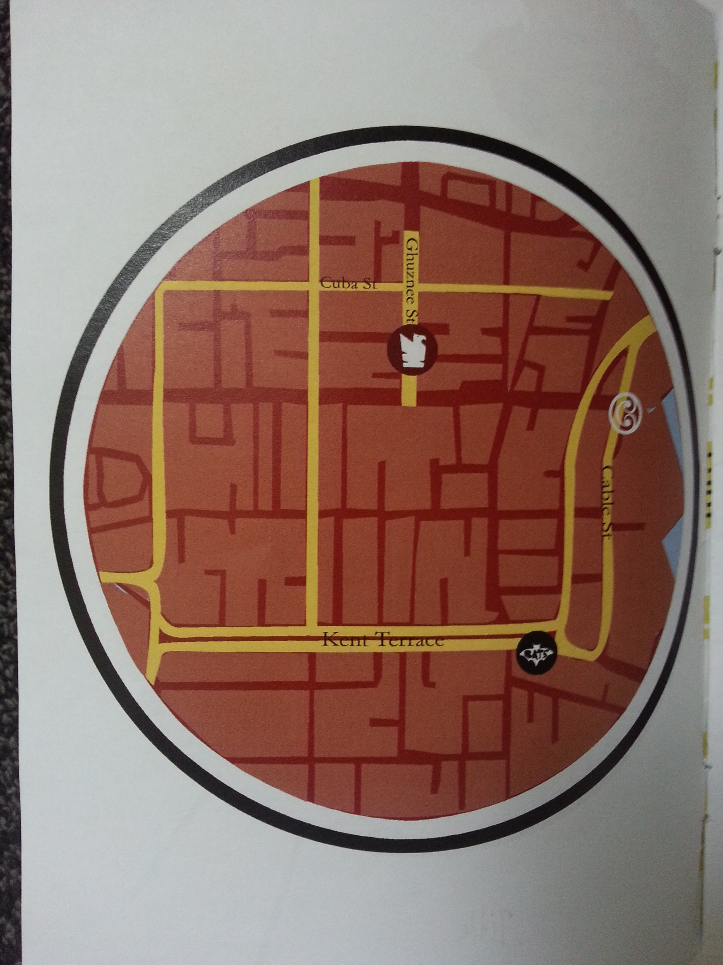
need to eliminate text by key.

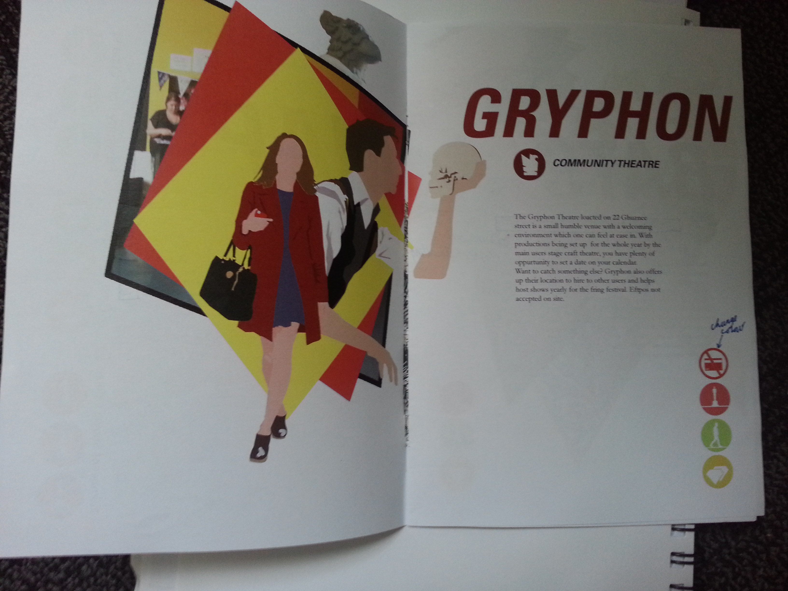
Gryphon design, incorporating image at site, repetitive shape, main colour use and use of prop. The images i feel help communicate far better entering theatre and welcome nature by colour weight.

text needs to be moved to univers, play with composition.
looking at how the spread flows between info and design.

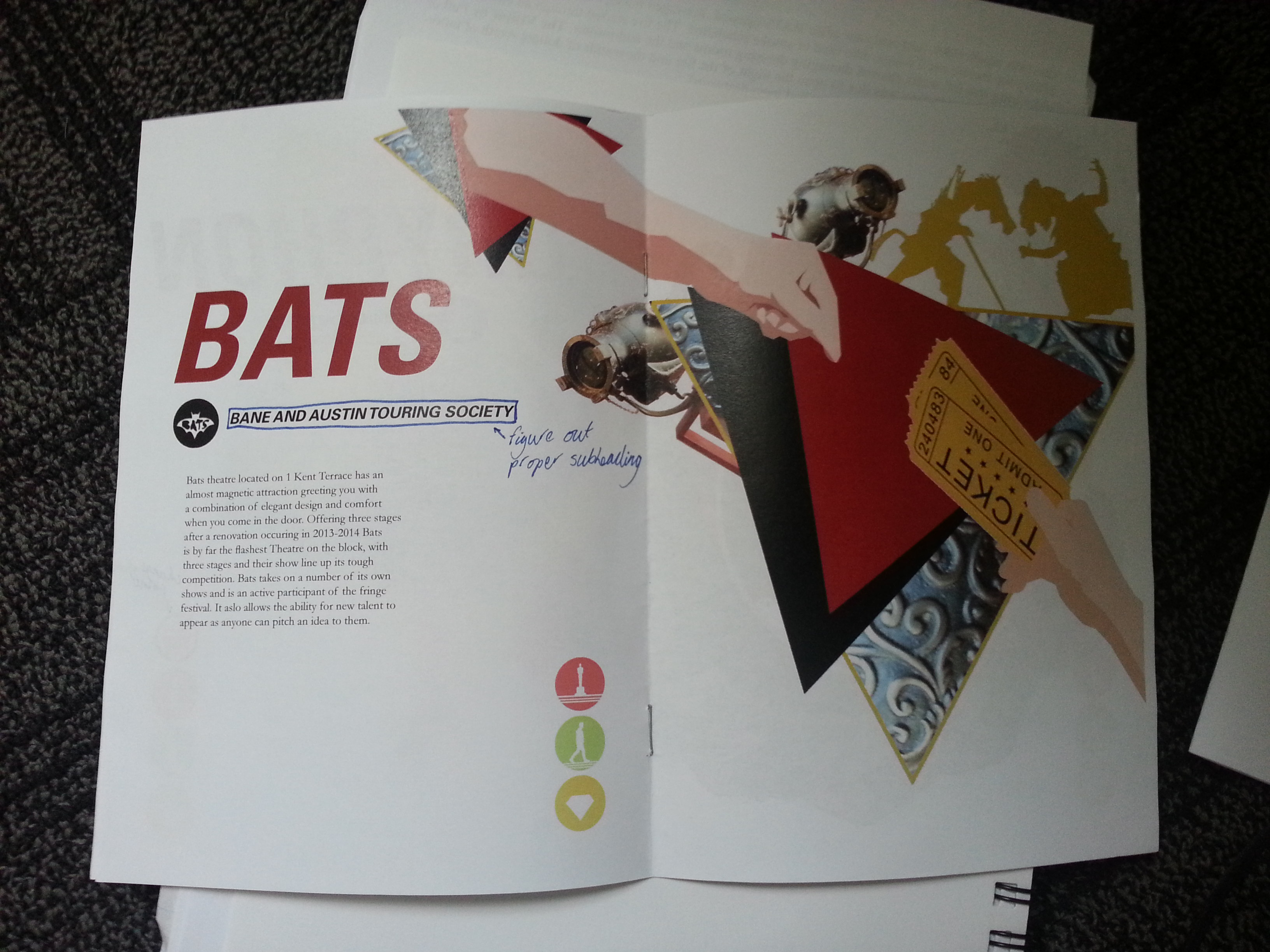
Need to find different subtitle to identify bats by.
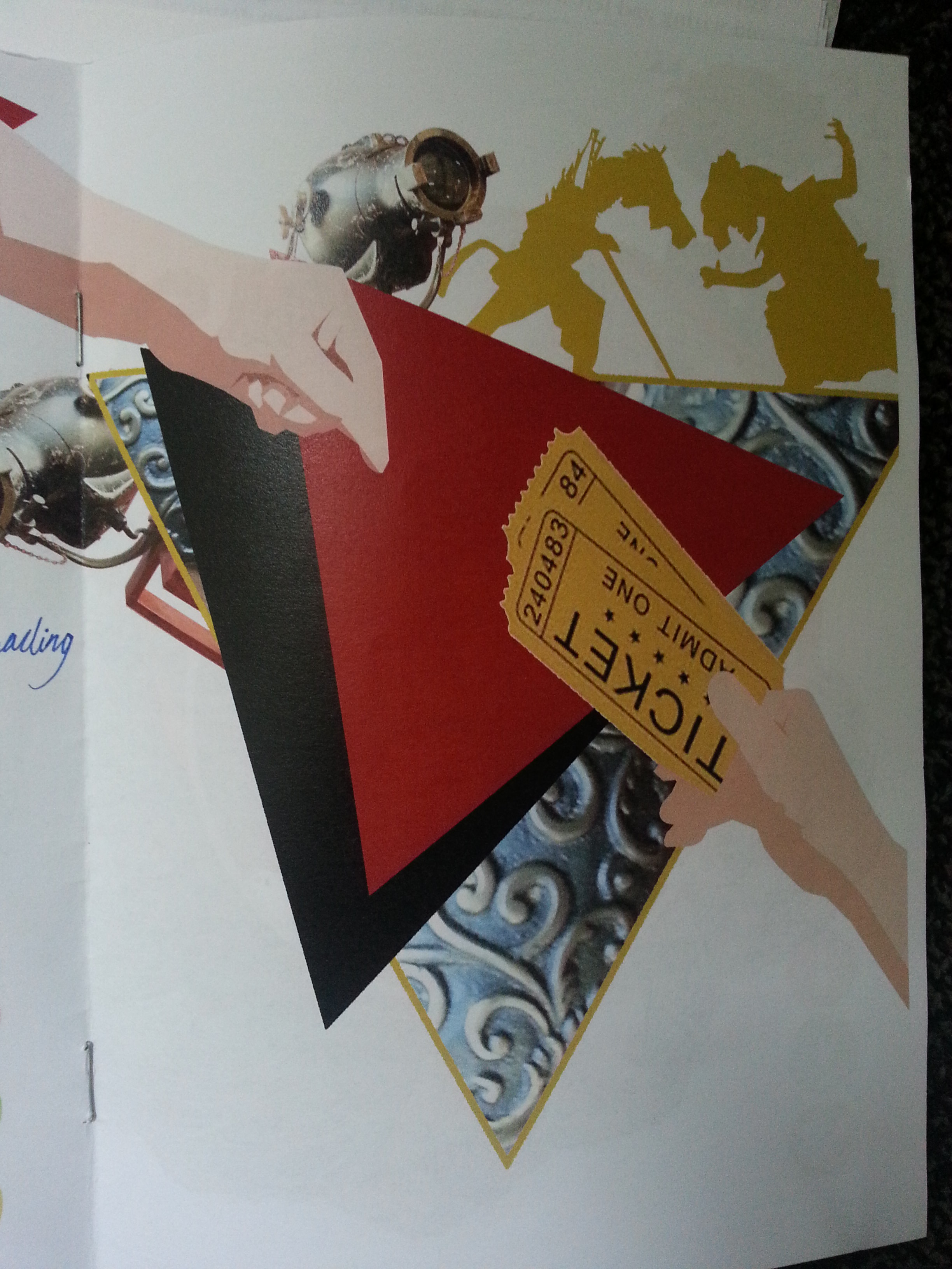
Looking at the image it has a lot more interesting elements.
Looking at the flow between 2 spreads.

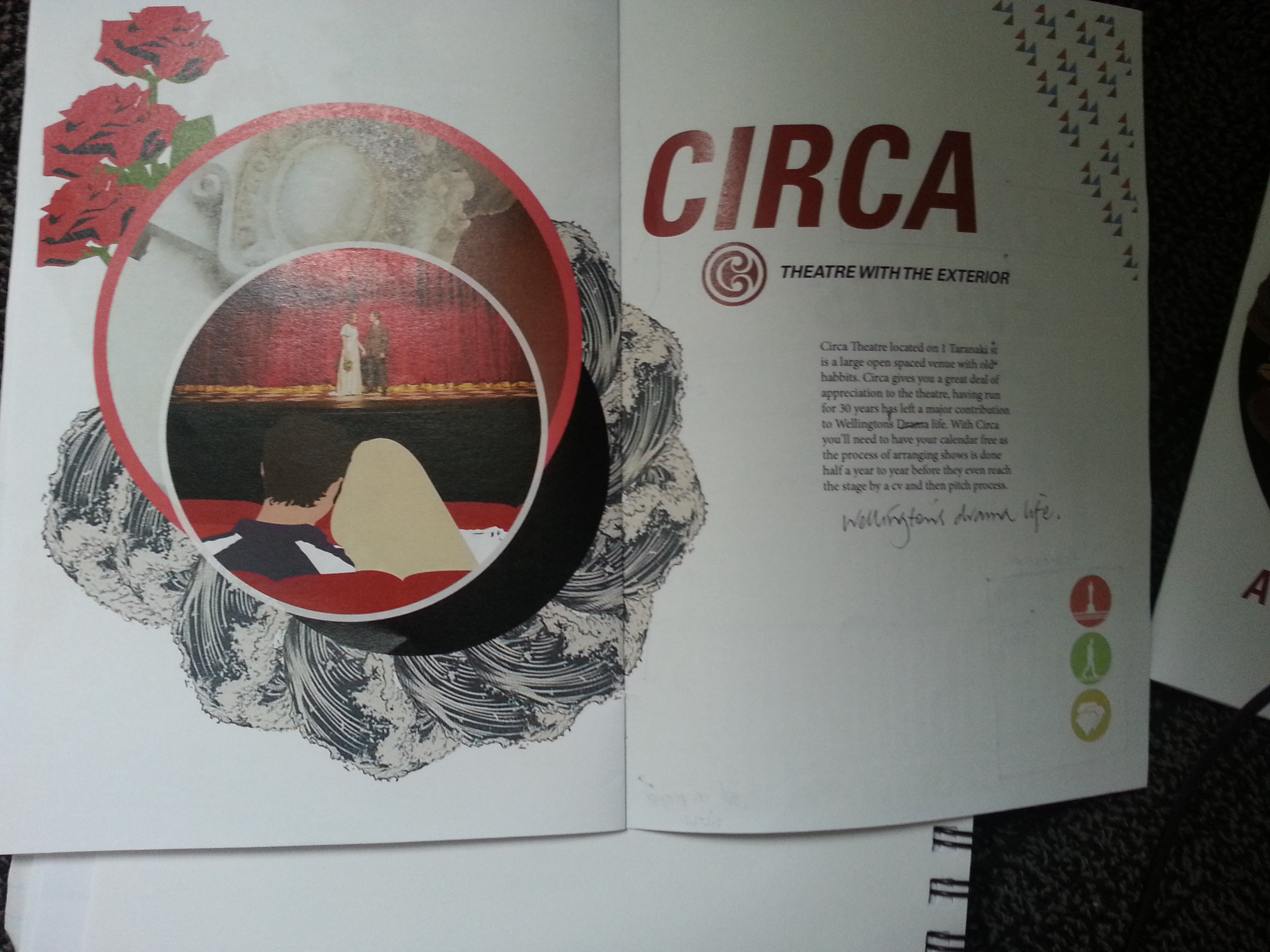
Circa’s image have recycled elements of last design into centre which gives a really nice centrepiece. Have used building architecture as pattern and the waves to symbolise location by the sea. The roses were to help symbolise the performance/viewing stage i wanted to represent.

Looking at circa’s info page, considering the elimination of triangle pattern as a conflicting aspect to image design.
Looking at balance and flow of the spread.
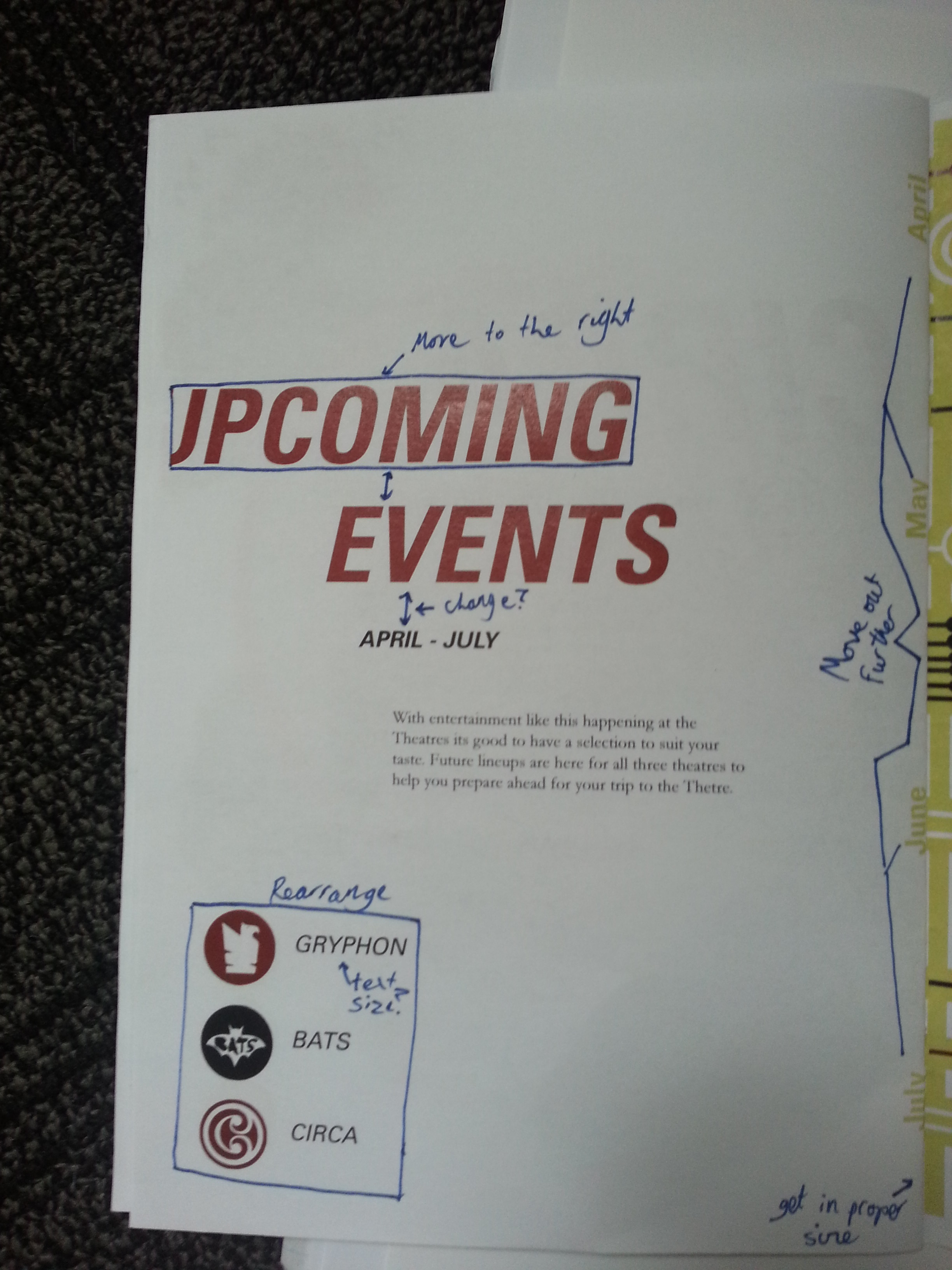
once again text is not well executed. The spacing needs to be sorted as well as placement of title. The keys to theatre needs rearranging and may not be necessary due to repetitive use in map and individual spreads.

no change apart from trying to communicate dates better but it clipped the circle date part near the top.

Looking at flow of spread and balance.
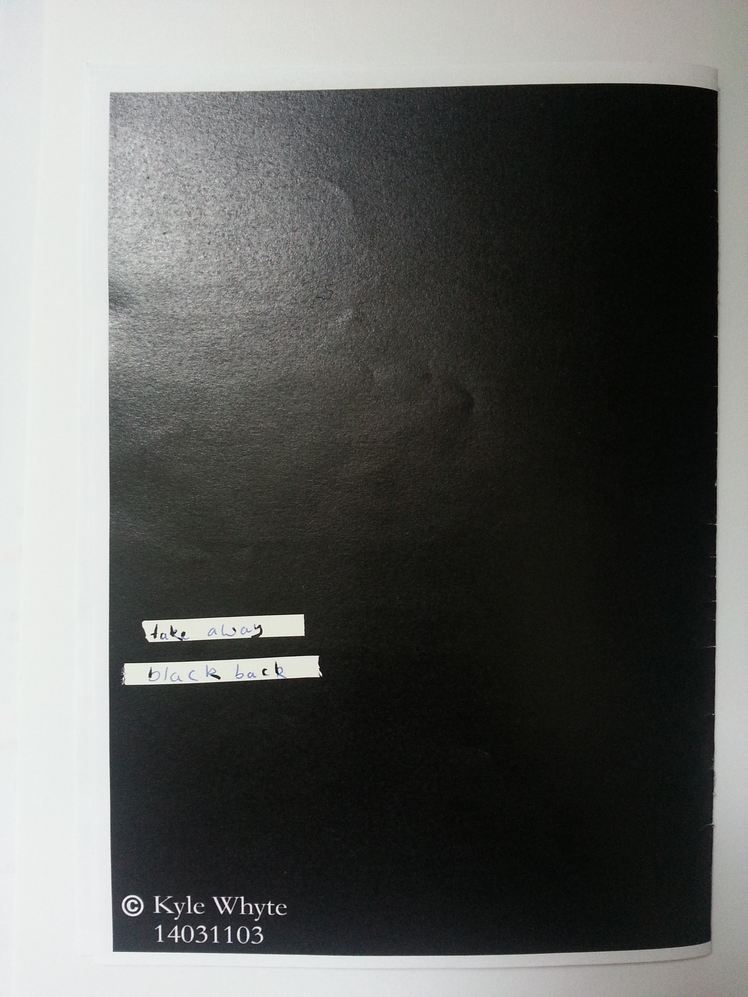
back cover which i’m going to eliminate the black as it is not consistent with any of the new brochure design.
